
Savant Rebrand
My Role: Brand Designer — Freelance
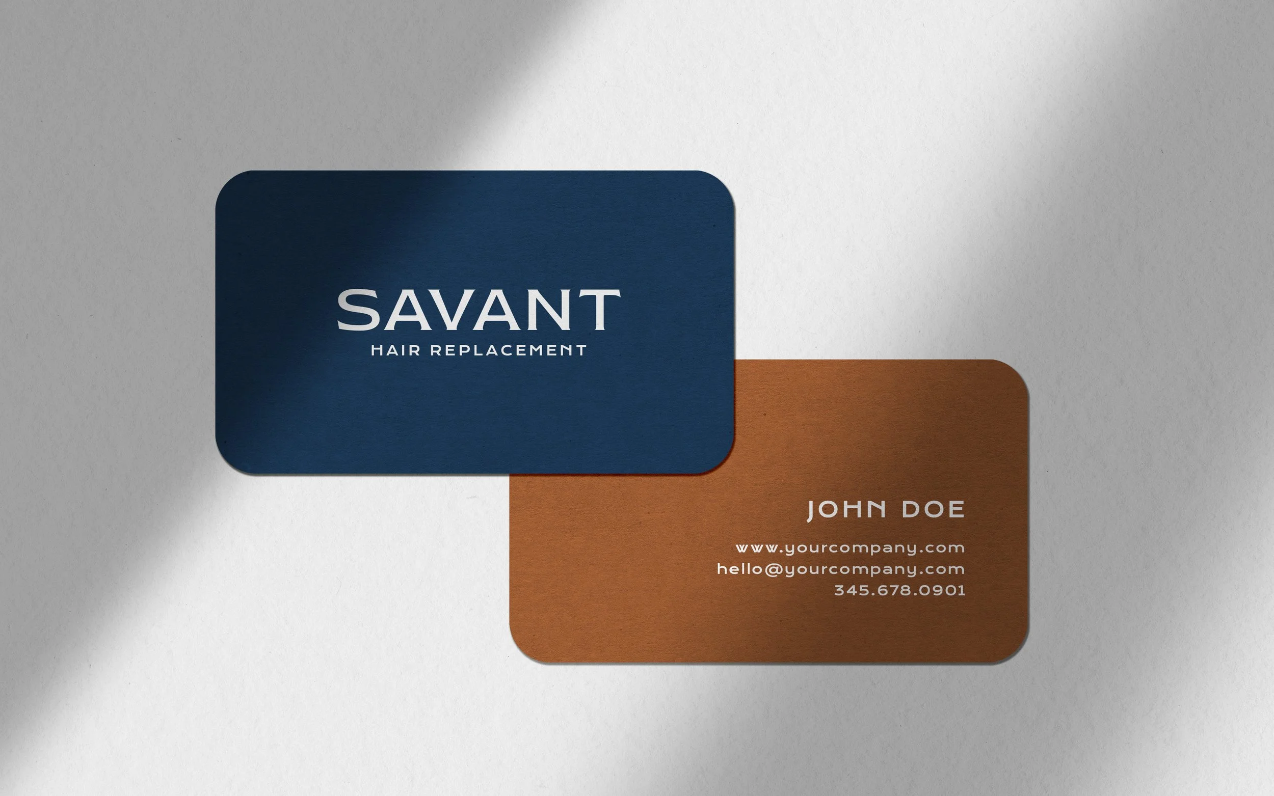
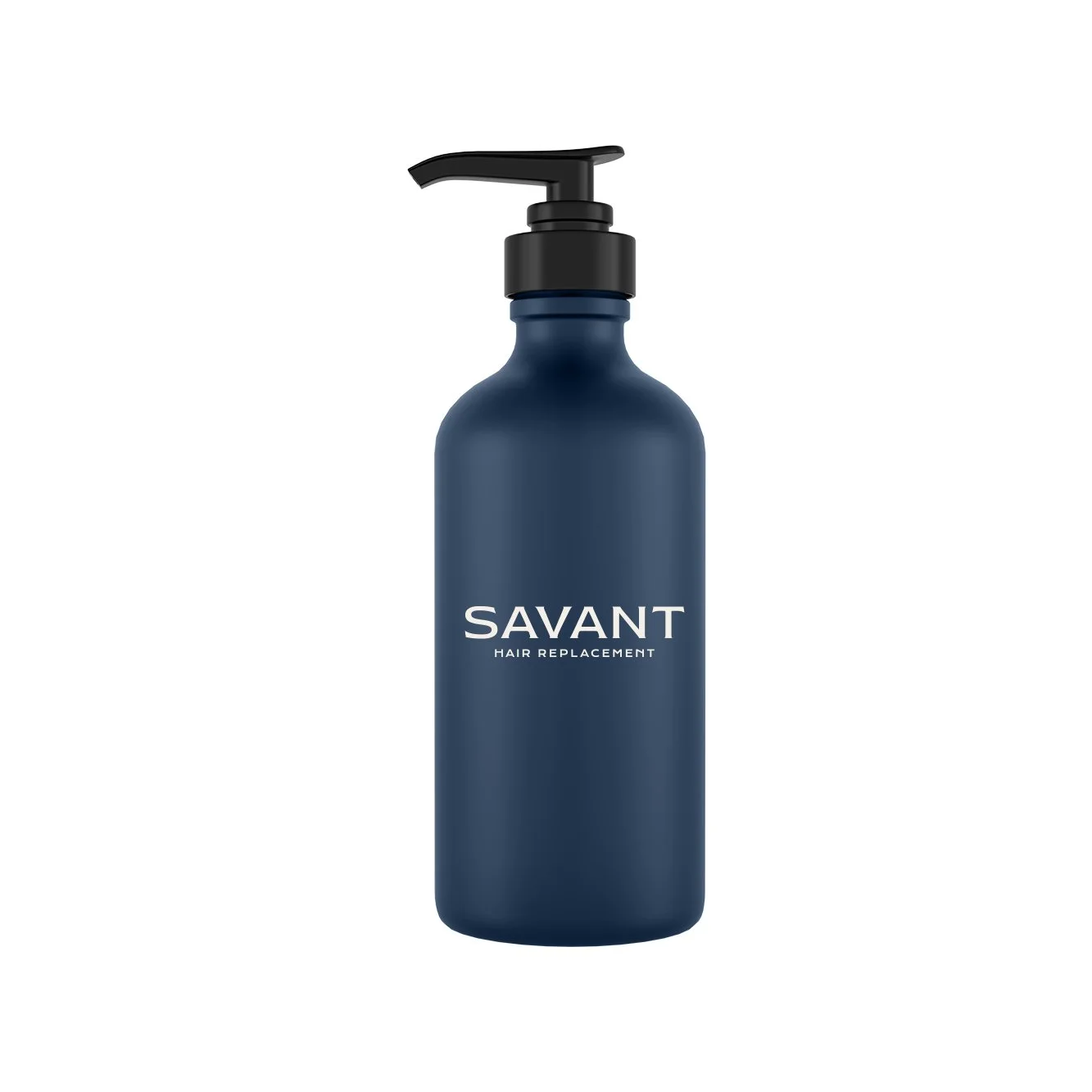
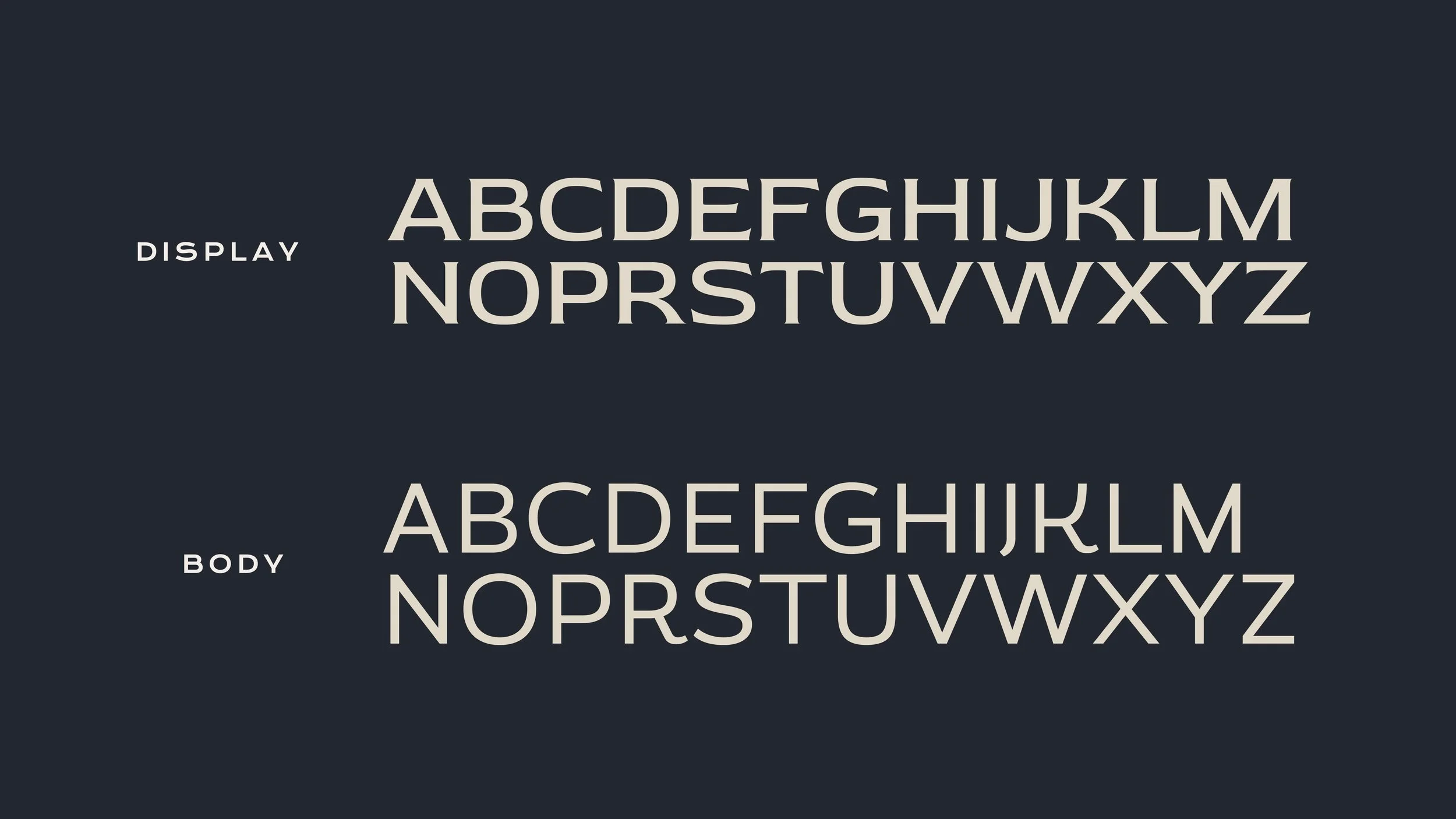
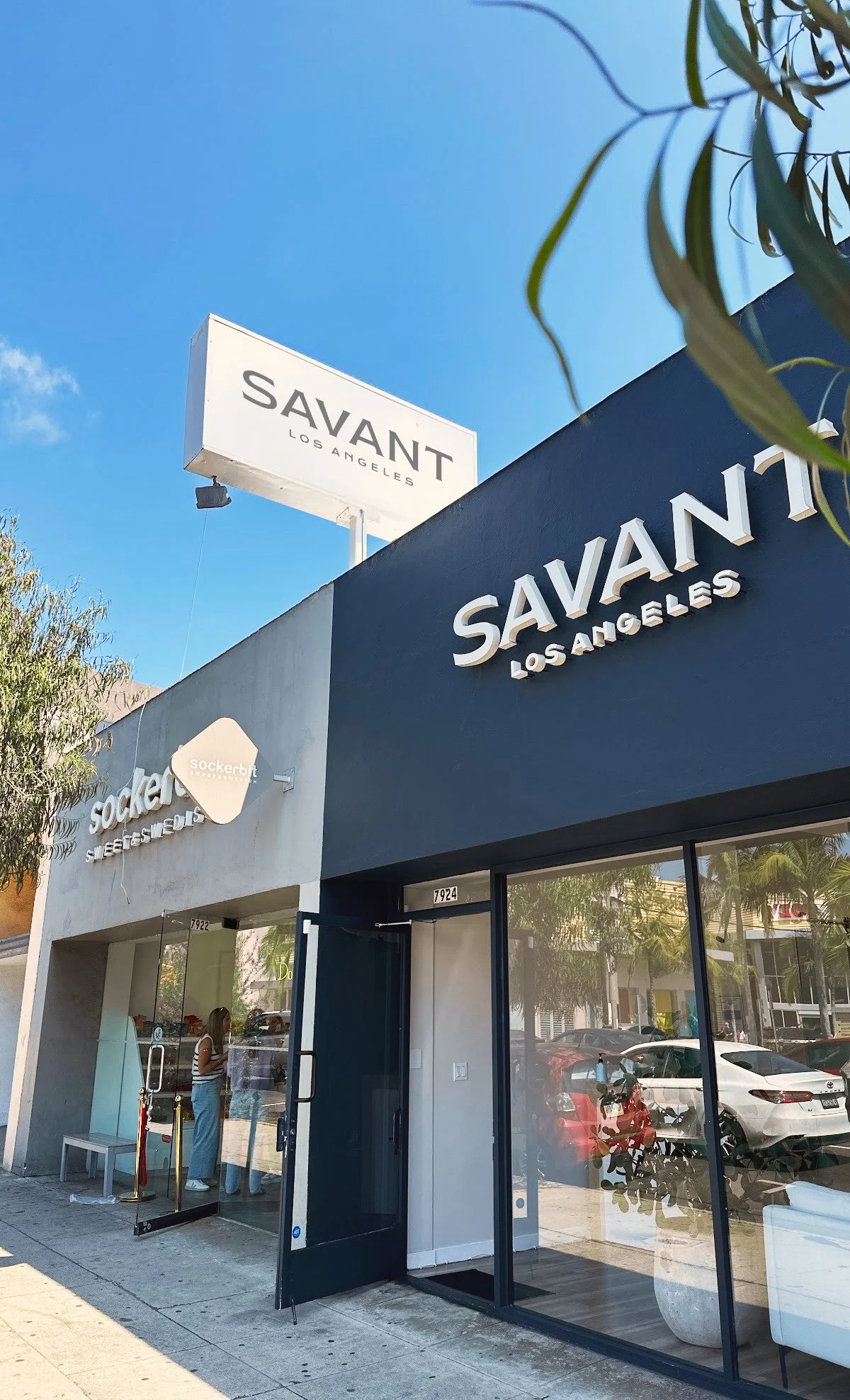
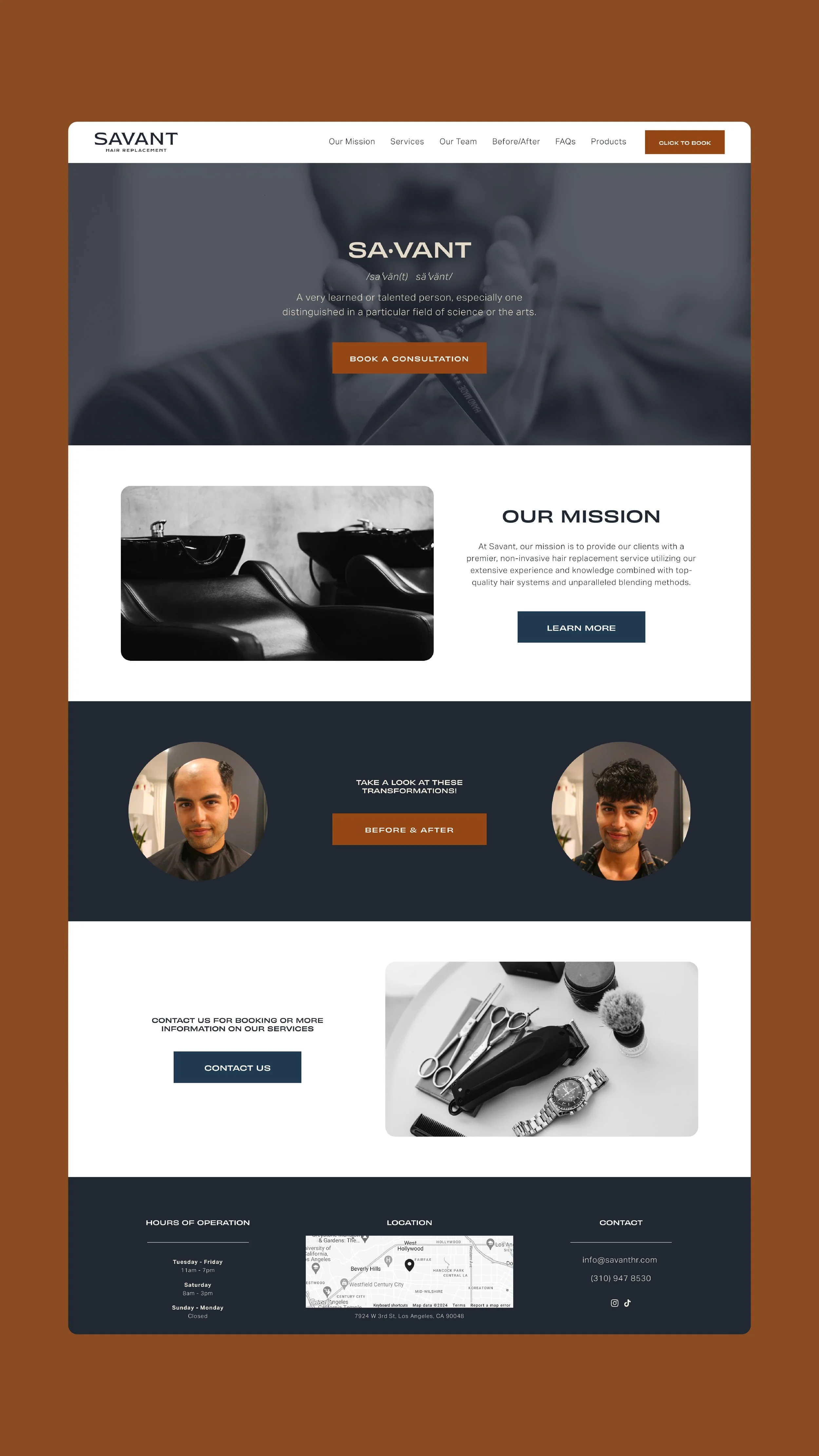
A full rebrand for a premium hair-replacement studio built around discretion and privacy. I landed on a flared sans serif that reads premium without feeling delicate, designed primary and secondary lockups for discreet signage, and carried the identity through to the website.
-
The Brief
Savant is a barbershop specializing in non-surgical hair replacement, and the work was a full rebrand. The central challenge was tone: hair loss is a sensitive, personal thing, and the brand had to carry that with discretion rather than calling attention to it. The business itself was built around privacy, with private suites and a discreet entrance option. The identity needed to deliver that same promise: premium and reassuring, a place you'd trust rather than one you'd be embarrassed to be seen at.The Solve
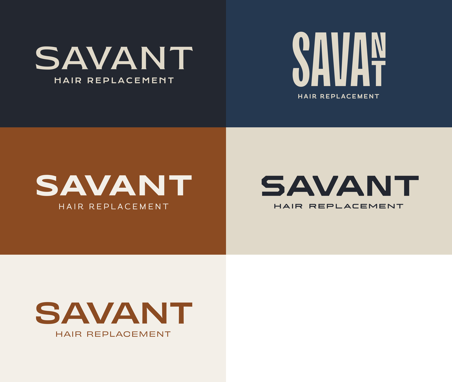
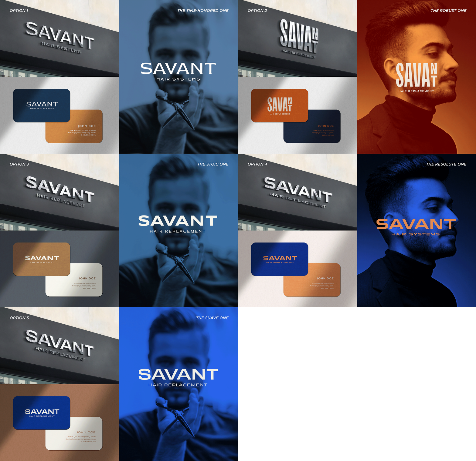
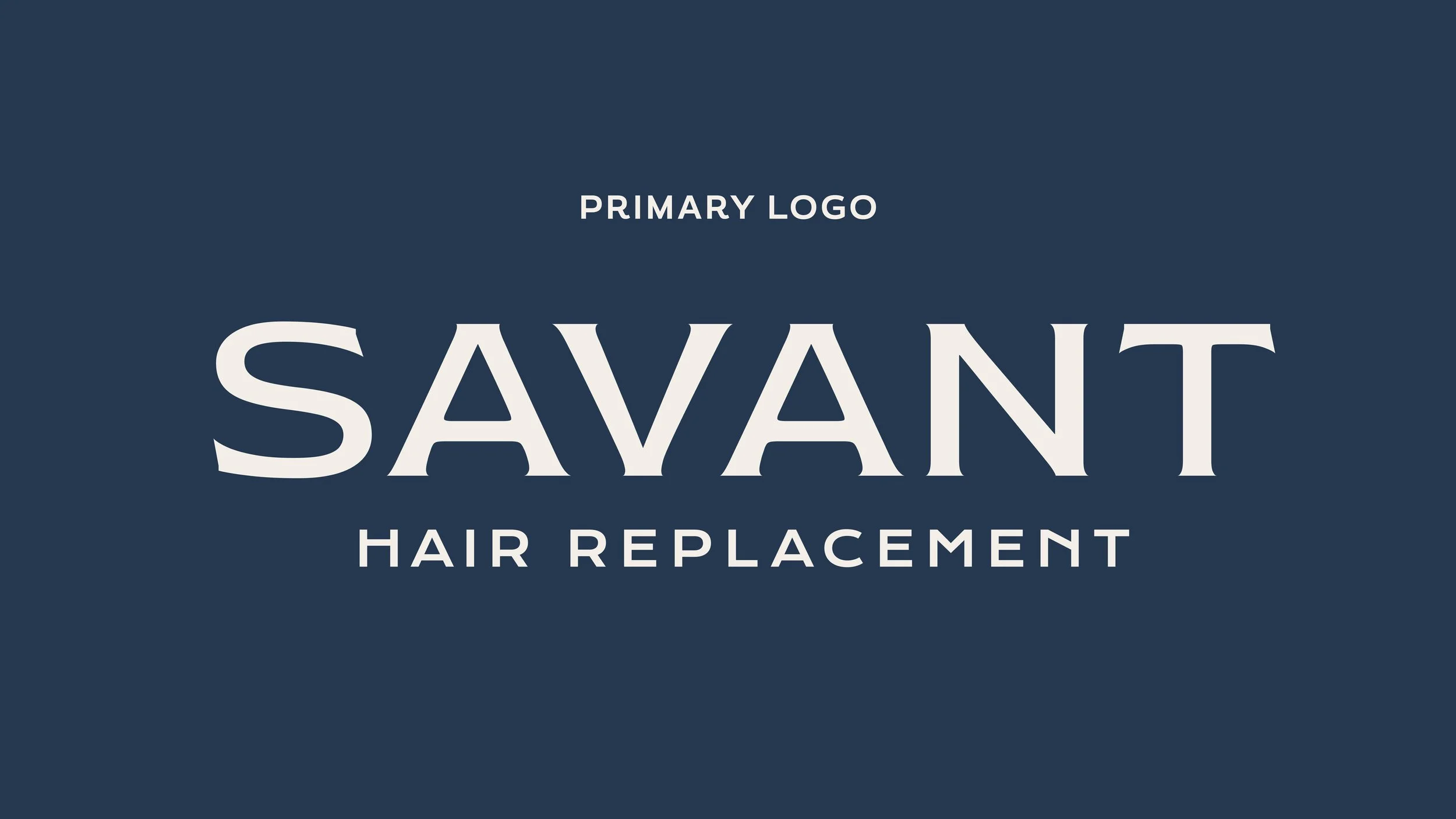
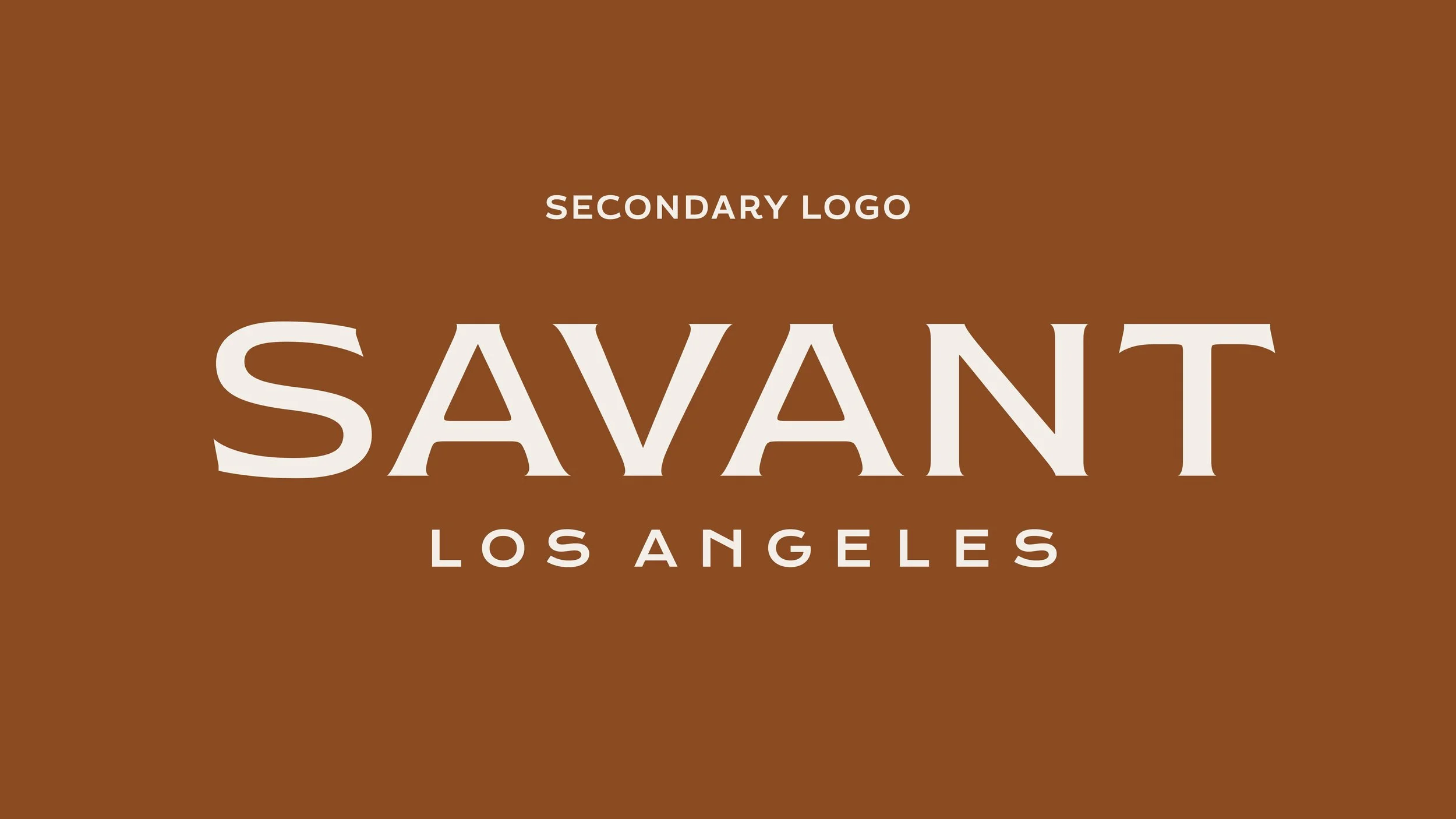
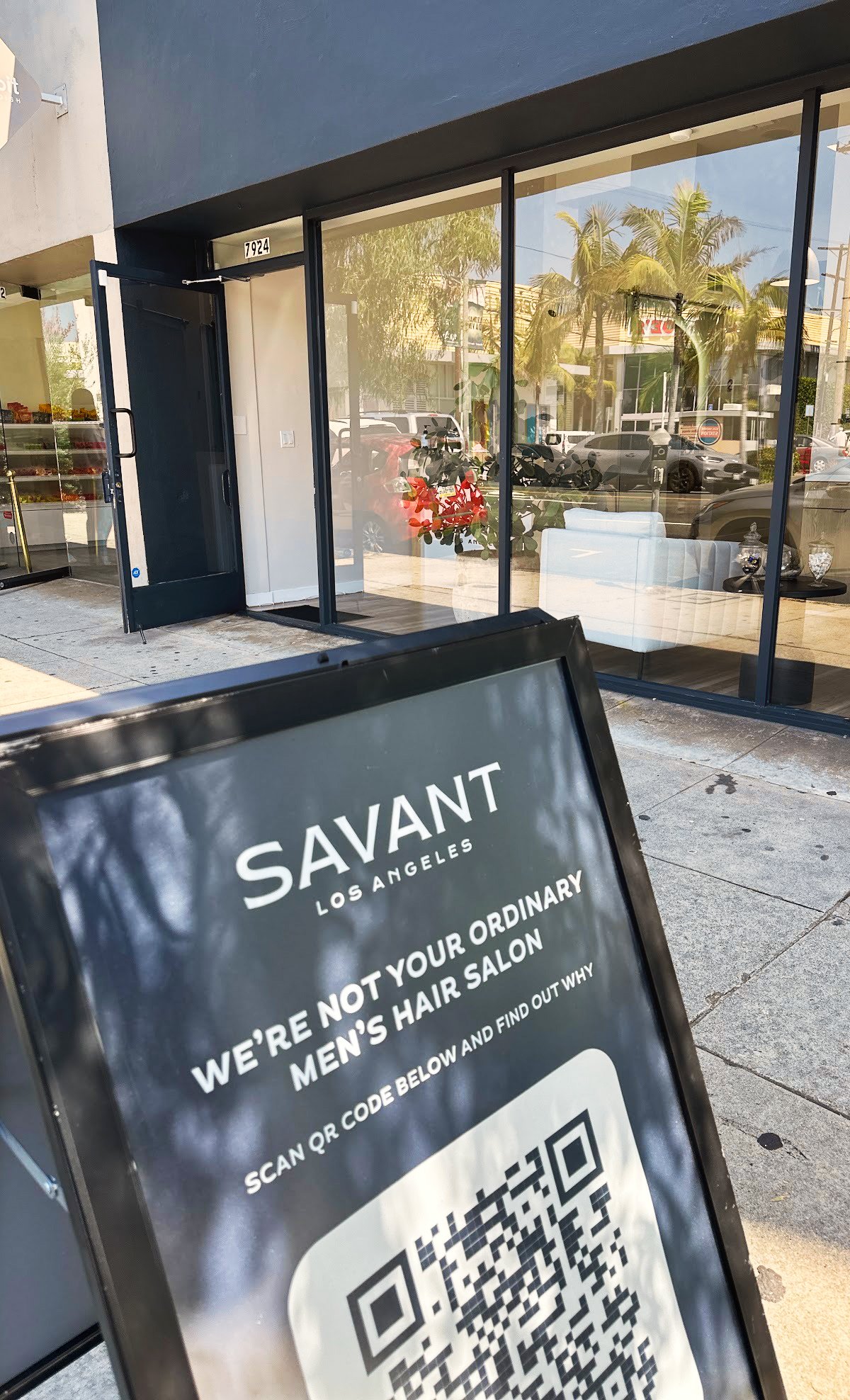
With a mostly male clientele, the brand needed to lean masculine while staying premium, and that guided my design decisions. I explored a range of logo directions, from stronger and more assertive to cleaner and more refined, and the client landed on the one that resolved the tension: a flared sans serif that reads premium without feeling delicate. Confident, but elevated.Discretion played a role too. The client requested two versions of the logo: a primary lockup that paired "Savant" with "Hair Replacement," and a secondary that swapped in "Los Angeles." The secondary went on the exterior signage, dropping "Hair Replacement" so passersby couldn't tell what the shop was, and a sidewalk A-frame I designed pointed the curious to the site by QR instead of spelling it out.
I carried the identity through to the website as well, designing the site in Squarespace and applying the full brand across it.
Brand Development
Brand Package
Applied
Full Case Study
The Brief
Savant is a barbershop specializing in non-surgical hair replacement, and the work was a full rebrand. The central challenge was tone: hair loss is a sensitive, personal thing, and the brand had to carry that with discretion rather than calling attention to it. The business itself was built around privacy, with private suites and a discreet entrance option. The identity needed to deliver that same promise: premium and reassuring, a place you'd trust rather than one you'd be embarrassed to be seen at.
The Solve
With a mostly male clientele, the brand needed to lean masculine while staying premium, and that guided my design decisions. I explored a range of logo directions, from stronger and more assertive to cleaner and more refined, and the client landed on the one that resolved the tension: a flared sans serif that reads premium without feeling delicate. Confident, but elevated.
Discretion played a role too. The client requested two versions of the logo: a primary lockup that paired "Savant" with "Hair Replacement," and a secondary that swapped in "Los Angeles." The secondary went on the exterior signage, dropping "Hair Replacement" so passersby couldn't tell what the shop was, and a sidewalk A-frame I designed pointed the curious to the site by QR instead of spelling it out.
I carried the identity through to the website as well, designing the site in Squarespace and applying the full brand across it.