
Edoardo’s Trattoria
Branding
My Role: Brand Designer — Freelance
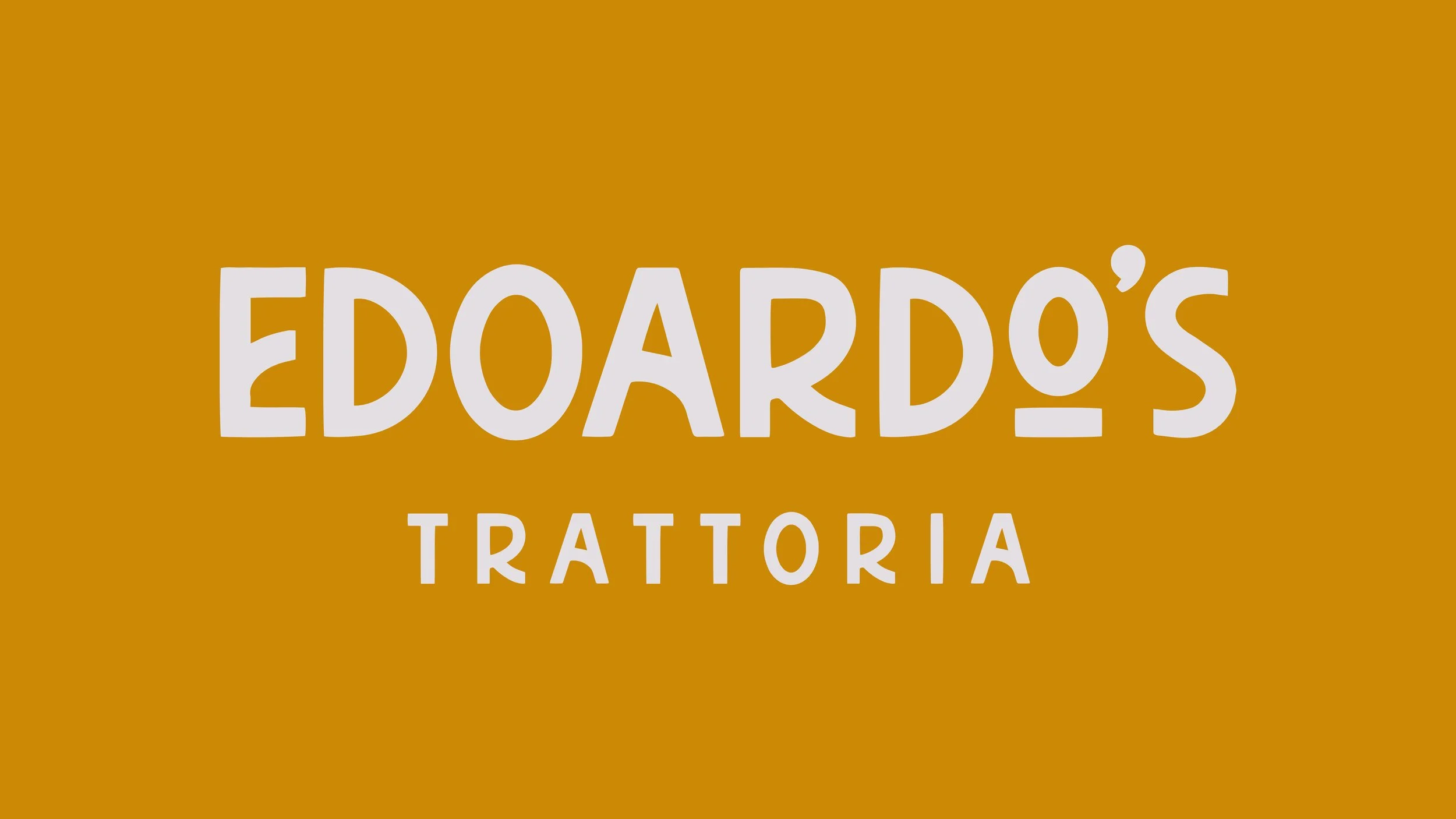
A full brand identity for an authentic Italian trattoria in Huntington, NY, designed from the ground up. I drew on the tradition of Italian hand-painted signage to give the brand the same warmth and craft as the kitchen, carried across menus, signage, and packaging.
-
The Brief
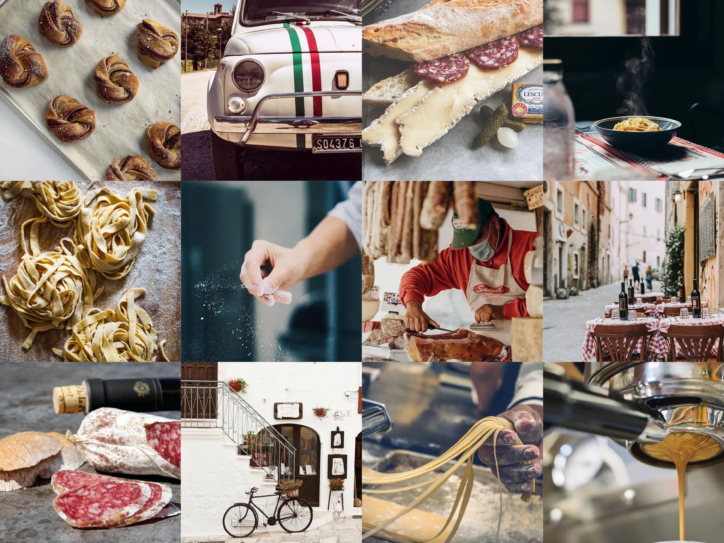
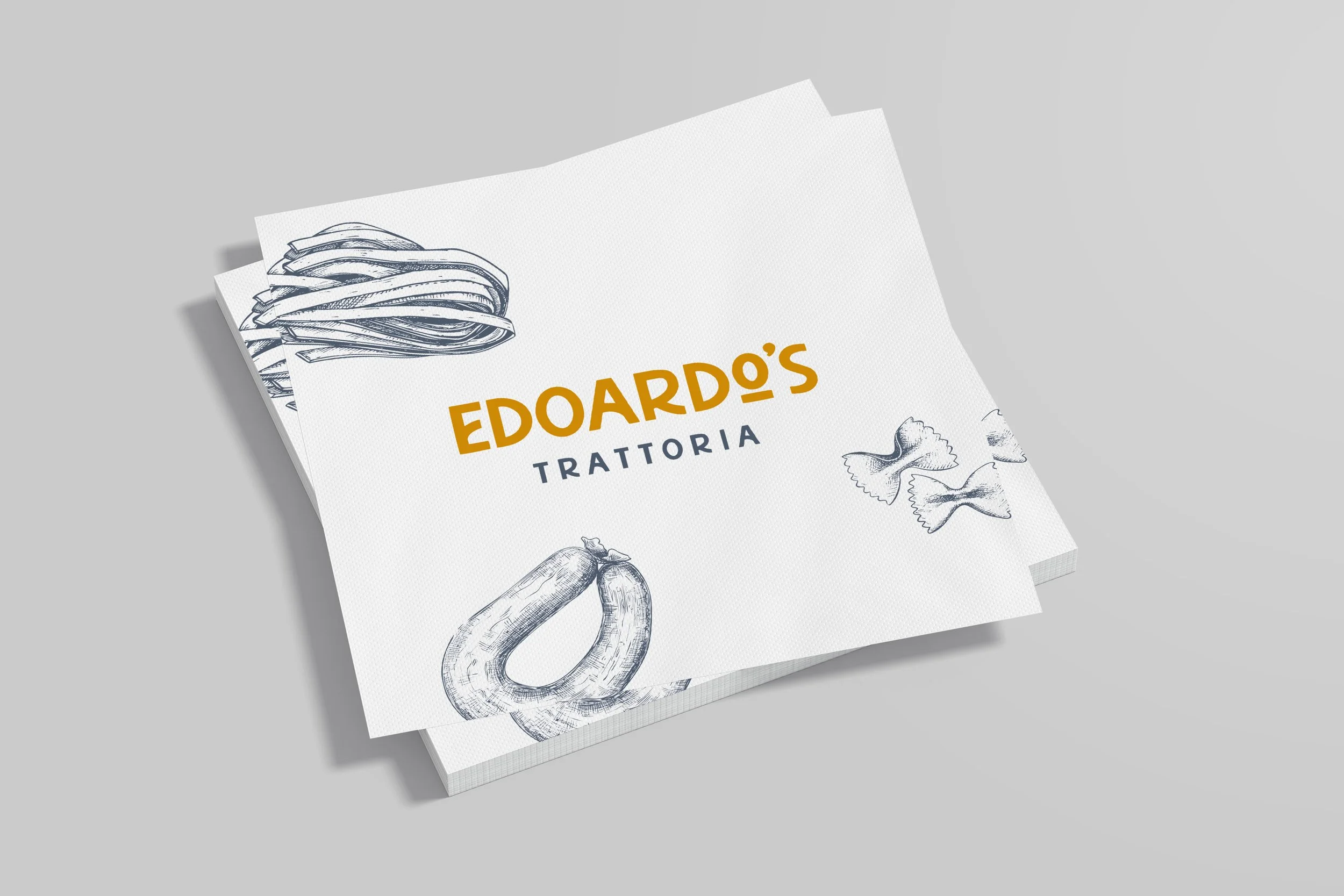
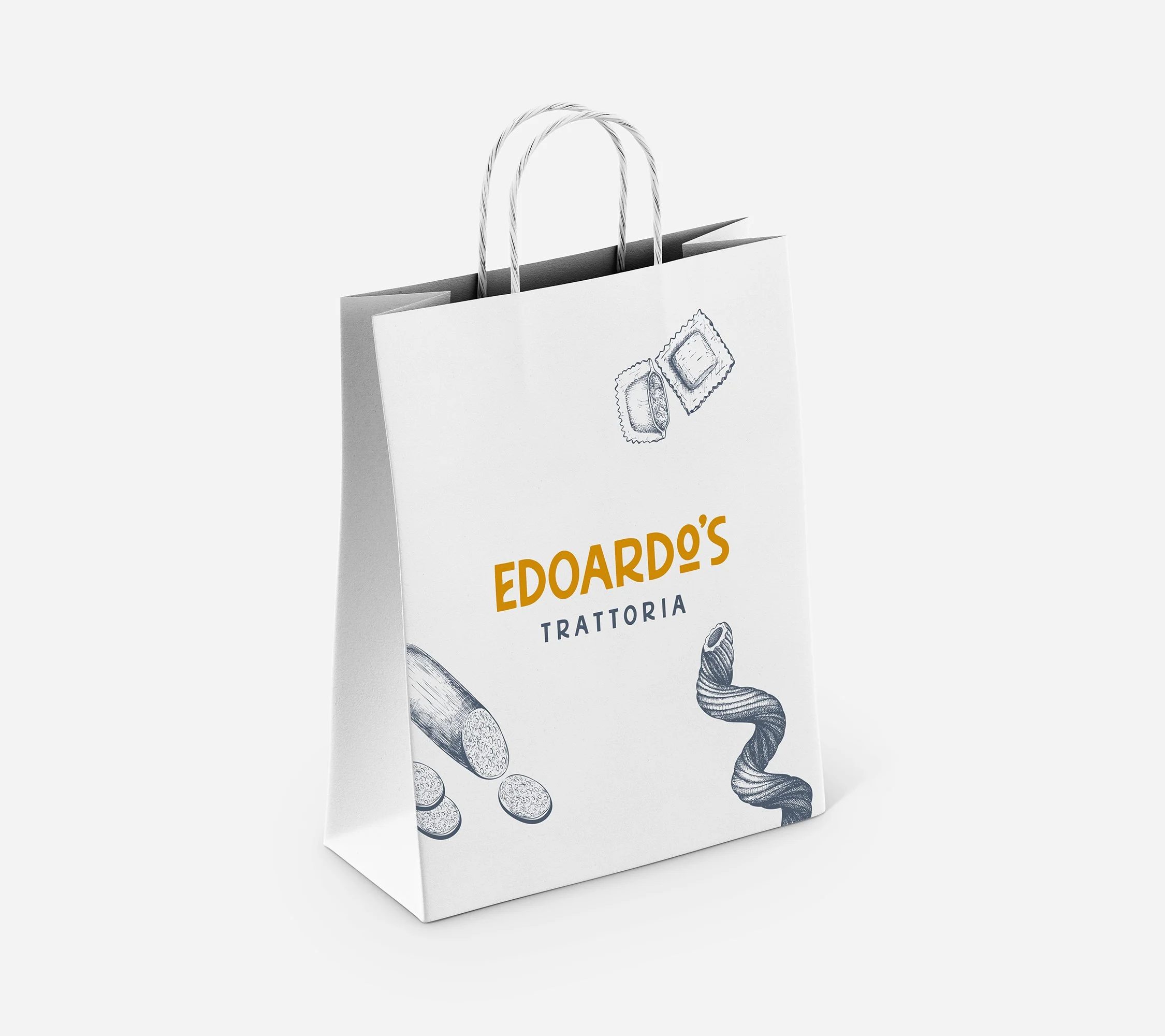
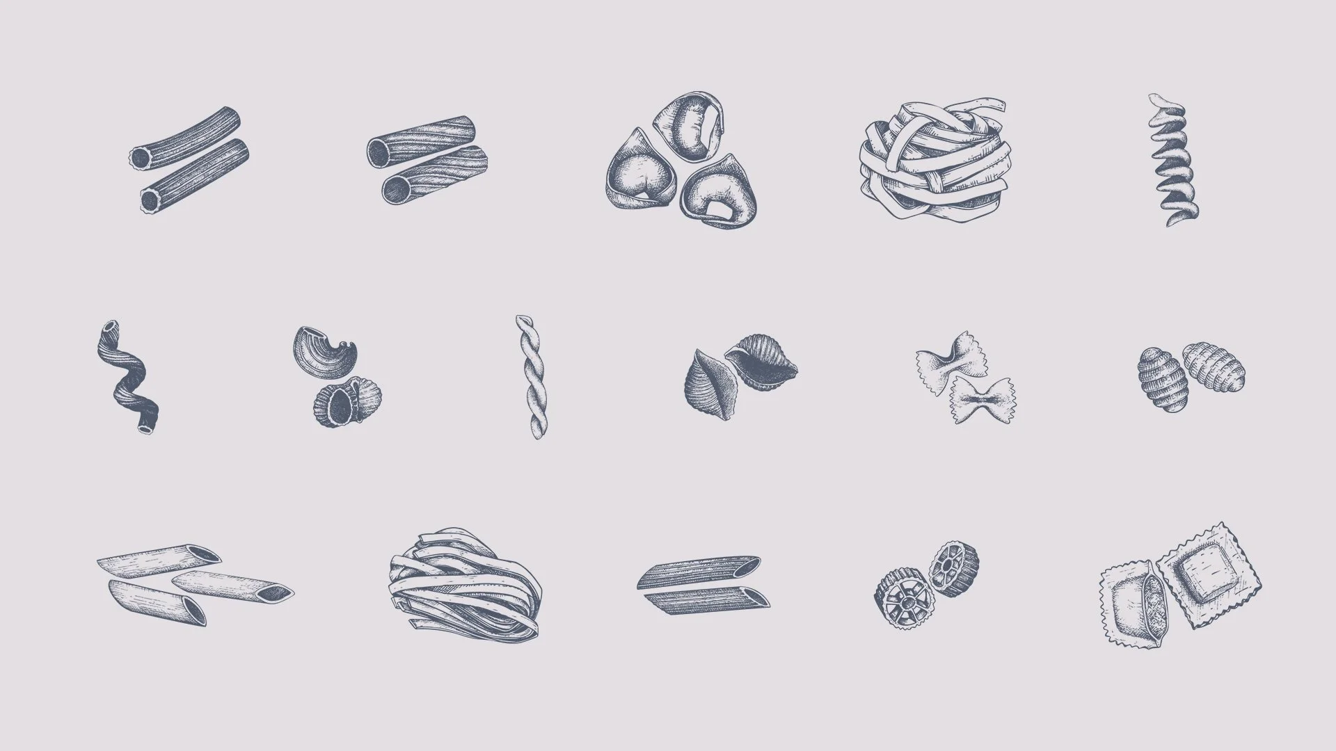
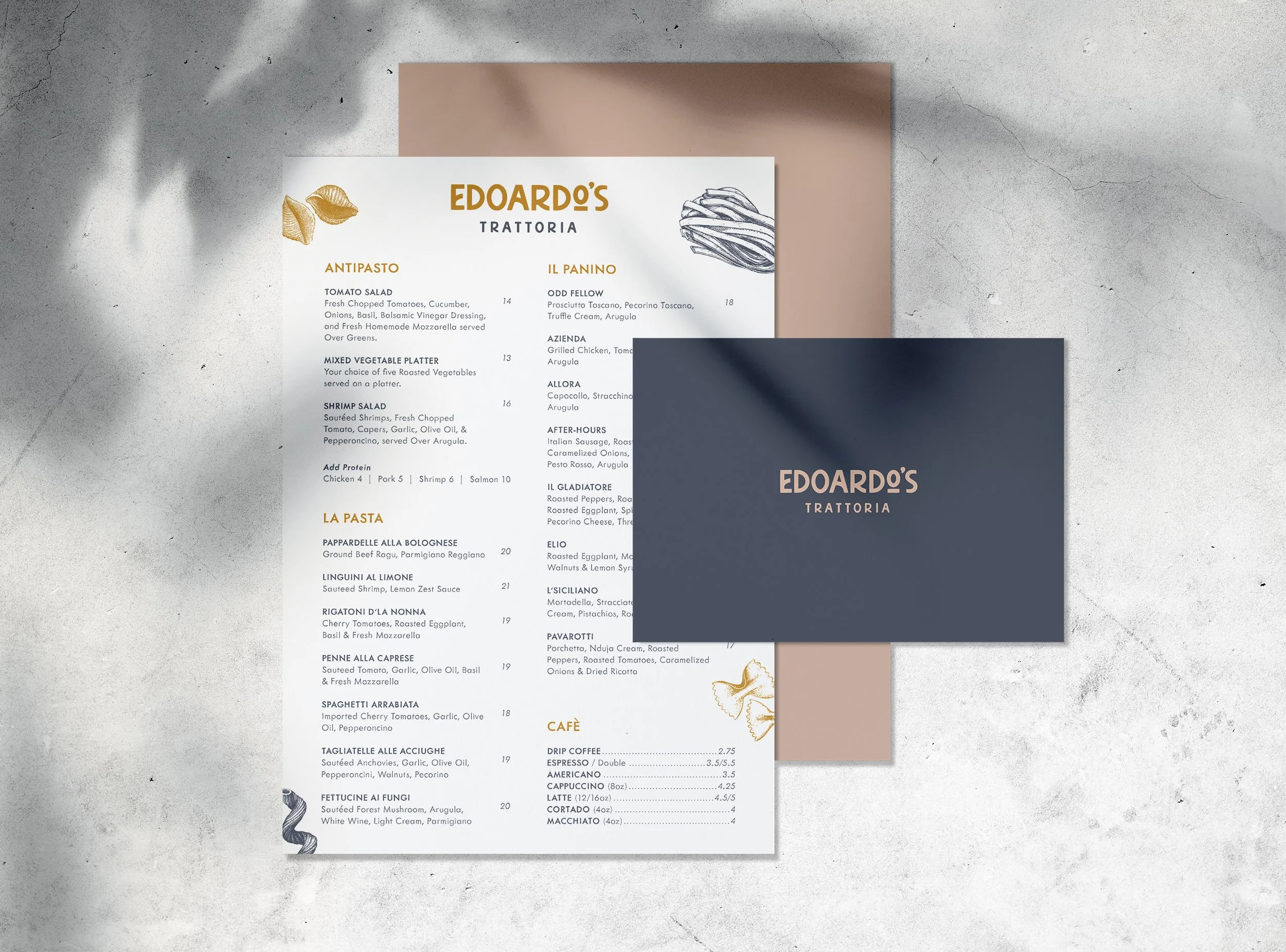
Edoardo's Trattoria is an authentic Italian restaurant in Huntington, NY: handmade pasta, local ingredients, and generations of family recipes. Its chef-owner was born in Central America but spent his early career training in Italy, and the brand needed to capture that same spirit. Working directly with the restaurant's investors, I designed the entire identity from the ground up.The scope covered the complete system: logo, color palette, typography, a curated licensed illustration package, menus, storefront signage, window decals, and packaging concepts presented in mockup.
The Solve
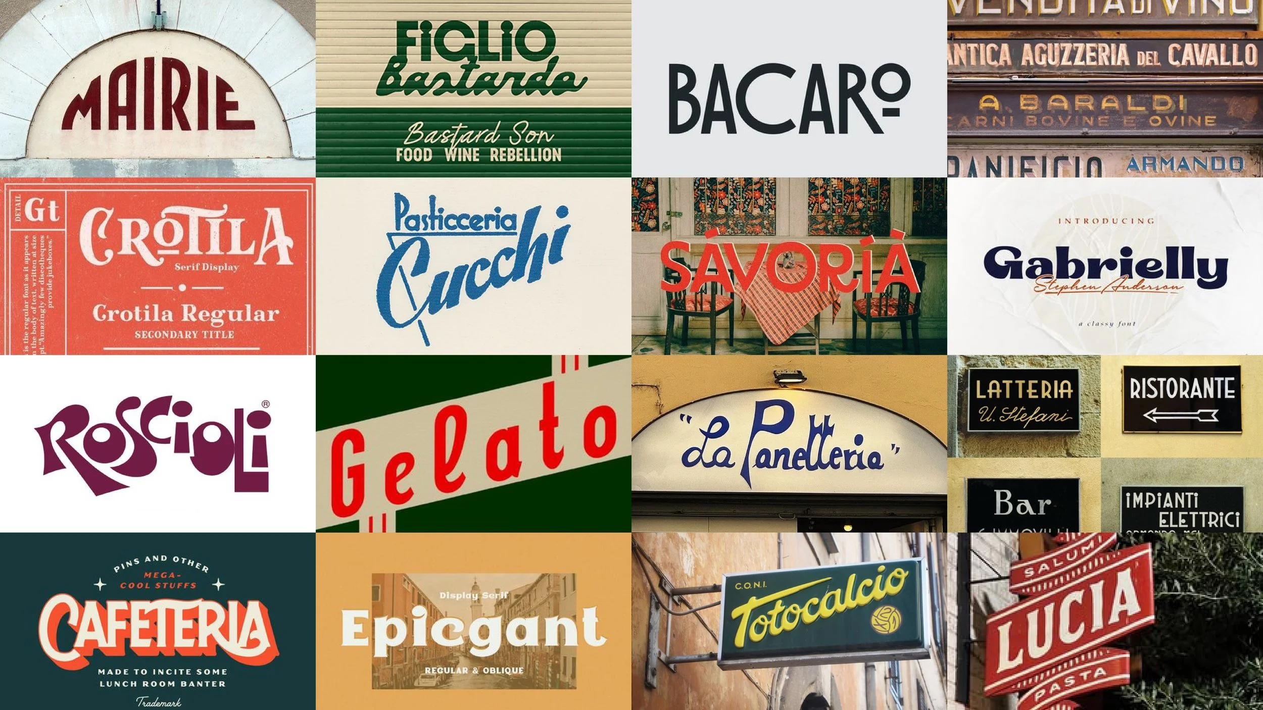
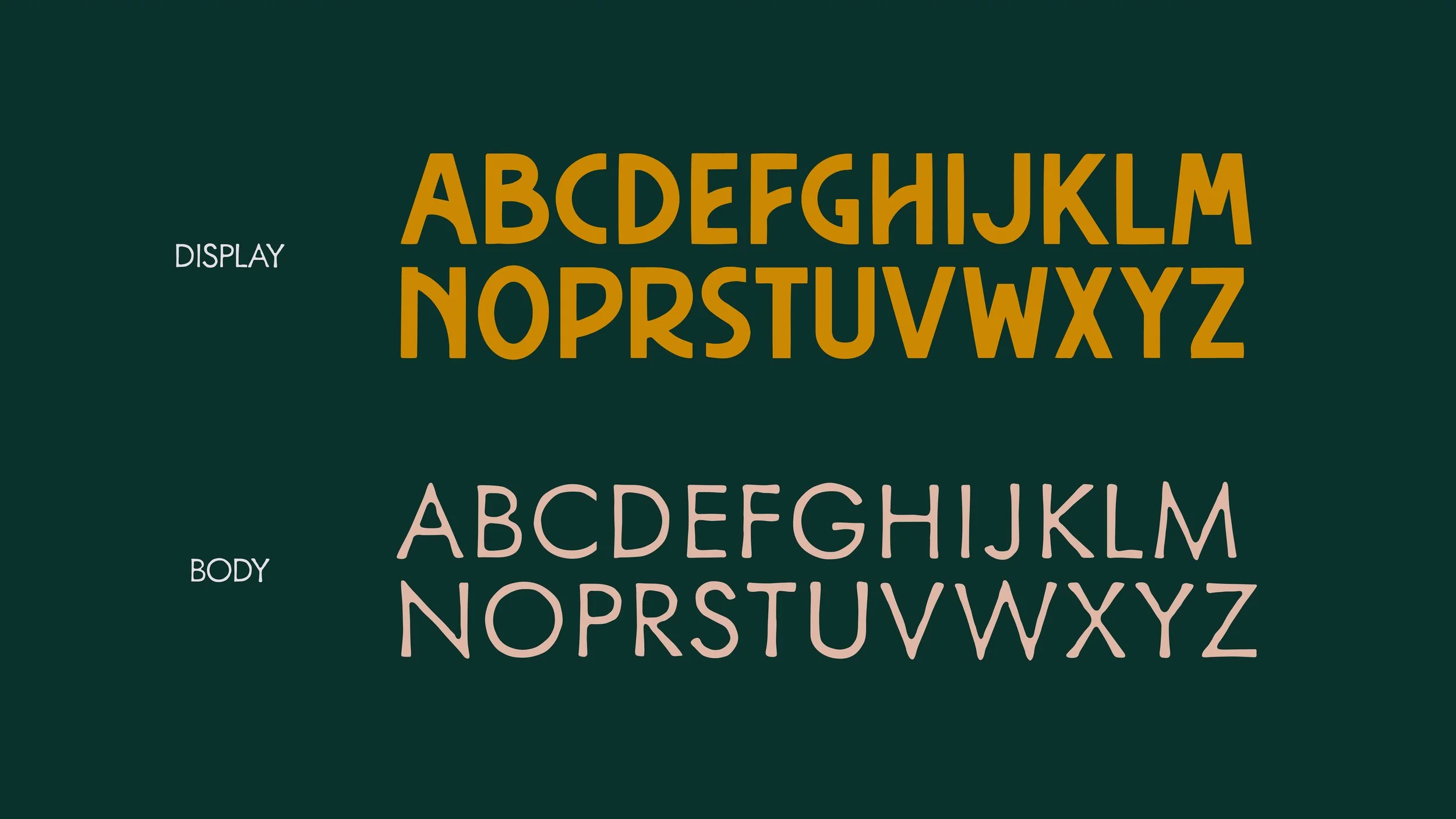
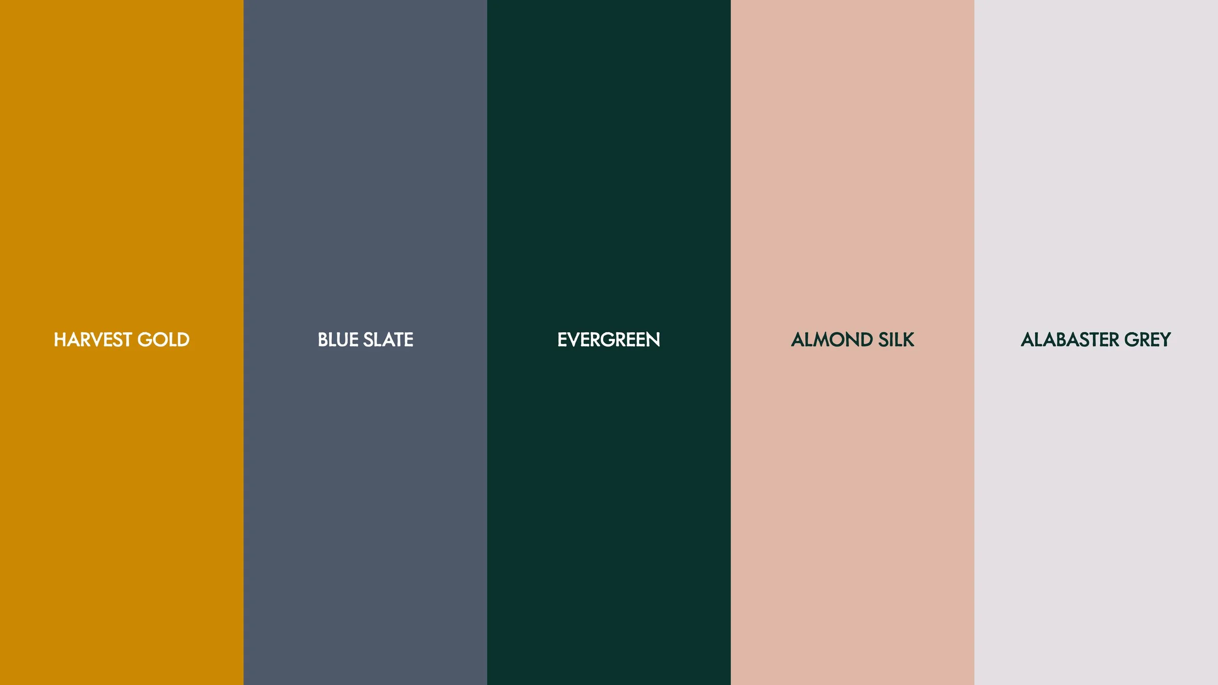
It all started with the chef's story, which I wanted the brand to evoke: warm, rustic, and made by hand. I leaned into the tradition of Italian hand-painted signage: the organic, slightly irregular lettering found on old trattorias and storefronts across Italy. The typeface I chose for the logo carries that same hand-rendered quality, giving the brand a warmth and craft that mirrors the kitchen. The client also pointed to a few brands they admired for their coloring and rustic feel, a direction that blended naturally with the handmade approach and helped shape the palette.
Brand Development
Brand Package
Applied
Full Case Study
The Brief
Edoardo's Trattoria is an authentic Italian restaurant in Huntington, NY: handmade pasta, local ingredients, and generations of family recipes. Its chef-owner was born in Central America but spent his early career training in Italy, and the brand needed to capture that same spirit. Working directly with the restaurant's investors, I designed the entire identity from the ground up.
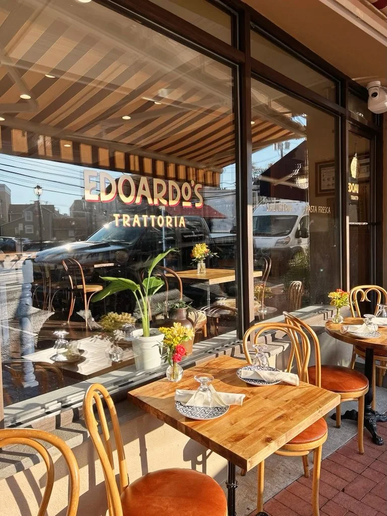
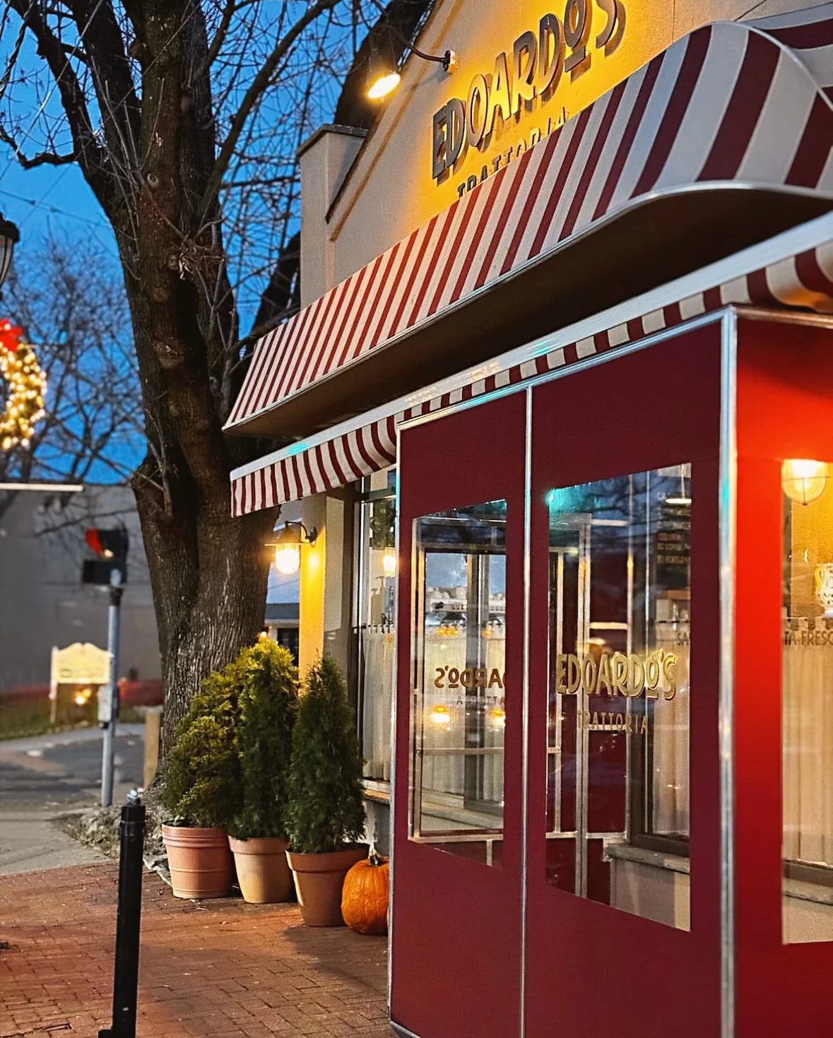
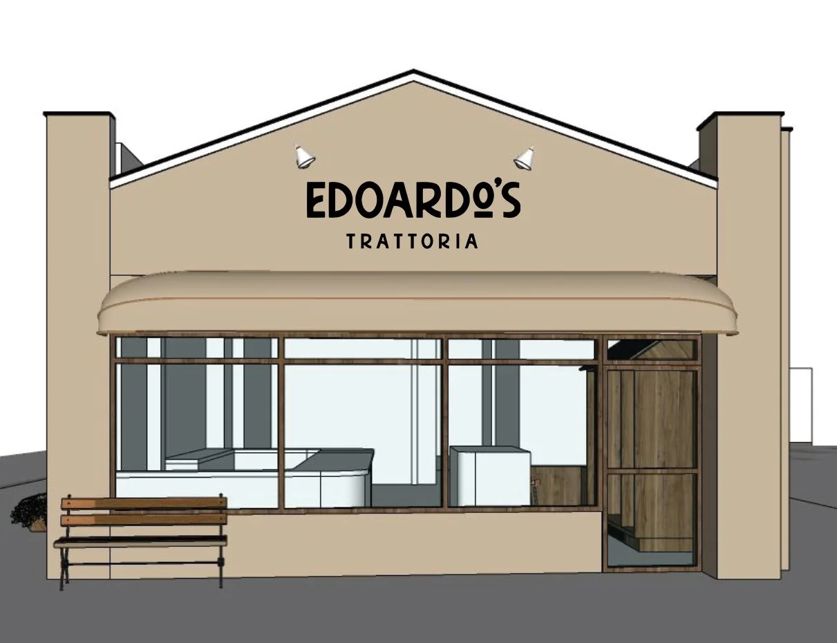
The scope covered the complete system: logo, color palette, typography, a curated licensed illustration package, menus, storefront signage, window decals, and packaging concepts presented in mockup.
The Solve
It all started with the chef's story, which I wanted the brand to evoke: warm, rustic, and made by hand. I leaned into the tradition of Italian hand-painted signage: the organic, slightly irregular lettering found on old trattorias and storefronts across Italy. The typeface I chose for the logo carries that same hand-rendered quality, giving the brand a warmth and craft that mirrors the kitchen. The client also pointed to a few brands they admired for their coloring and rustic feel, a direction that blended naturally with the handmade approach and helped shape the palette.